A wardrobe of muted colors and relaxed cuts can feel easy to wear, but sometimes the pieces blur together or carry more fabric than you want. I would work on one outfit at a time: keep the colors you enjoy, check how the cloth falls and add only as much definition as the outfit needs. The labels can help organize experiments without deciding the result for you.
Give a relaxed outfit one point of definition
When a soft natural soft autumn outfit feels vague, the first temptation is often to add a belt. Sometimes that helps. Sometimes it gathers a thick sweater into an uncomfortable bundle and leaves the rest of the silhouette unchanged. I would first look at where the top ends, where the trousers begin and which layer has the most volume. One clear boundary may do more than tightening everything.
Soft Natural is an optional styling framework often discussed in terms of relaxed lines and gentle shaping. Soft Autumn is a seasonal color label usually described through muted, warmer color directions. These are aesthetic tools, with varying interpretations, rather than scientific classifications of people. You can borrow a useful combination without proving that you belong to either group.
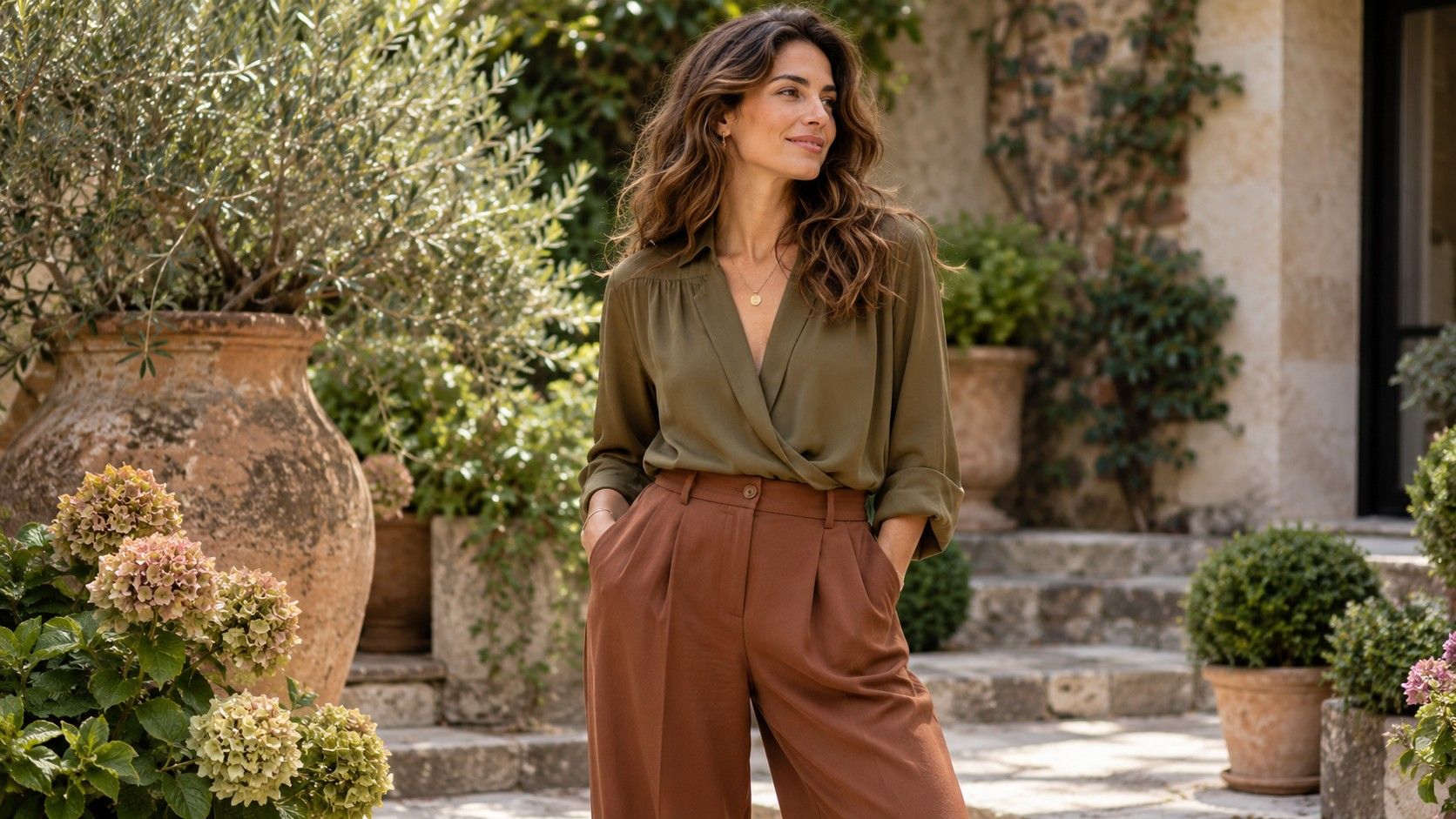
Try straight trousers with a softly shaped shirt and leave the collar open to a comfortable depth. Then compare the shirt untucked, shallowly tucked and open over a simple top. Watch the fabric at the back as well as the front. A little waist indication may be enough for your preference; you may prefer the cleaner fall of the untucked version. Neither result needs a rule about what your body must wear.
Layer muted warm colors without losing the outfit
Olive, softened rust, warm brown and creamy beige are useful candidates for an experiment, provided you already like them. They are examples rather than a fixed palette prescription. Put two pieces beside each other in daylight before getting dressed. One olive may look gray beside a yellow-green, while another can feel rich beside brown. Color names on a retailer page will not settle that difference.
If similar colors merge more than you want, separate them by depth. A lighter oatmeal top over deeper olive trousers can give you a visible shape without a strong black-and-white division. Reverse the placement and see whether you prefer a dark top and lighter bottom. The position of a color changes the outfit even when the same two shades are involved.
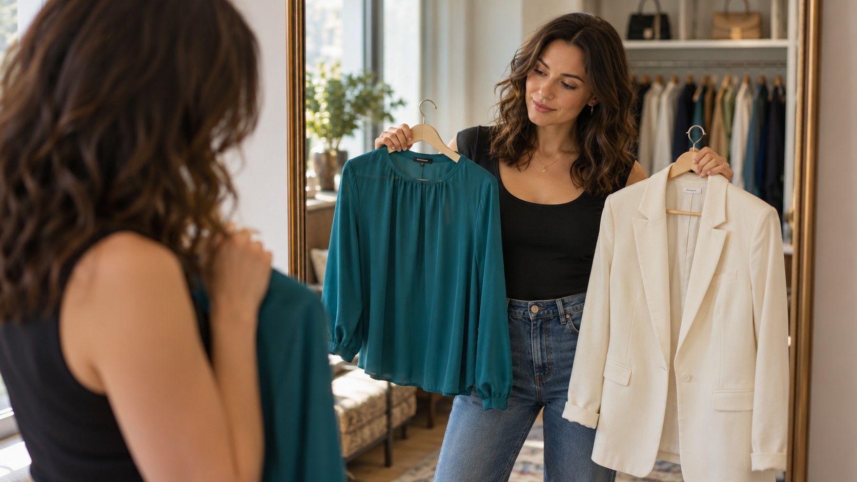
Near the face, compare two scarf or top colors under similar lighting. Avoid standing beneath a warm ceiling bulb for one and next to a window for the other. You are looking for a combination you enjoy and can repeat, not a verdict from a phone camera. If a color you love feels distracting at the neckline, keep it in a skirt, bag or shoe where you still get to wear it.
Compare fabric weight before buying another loose top
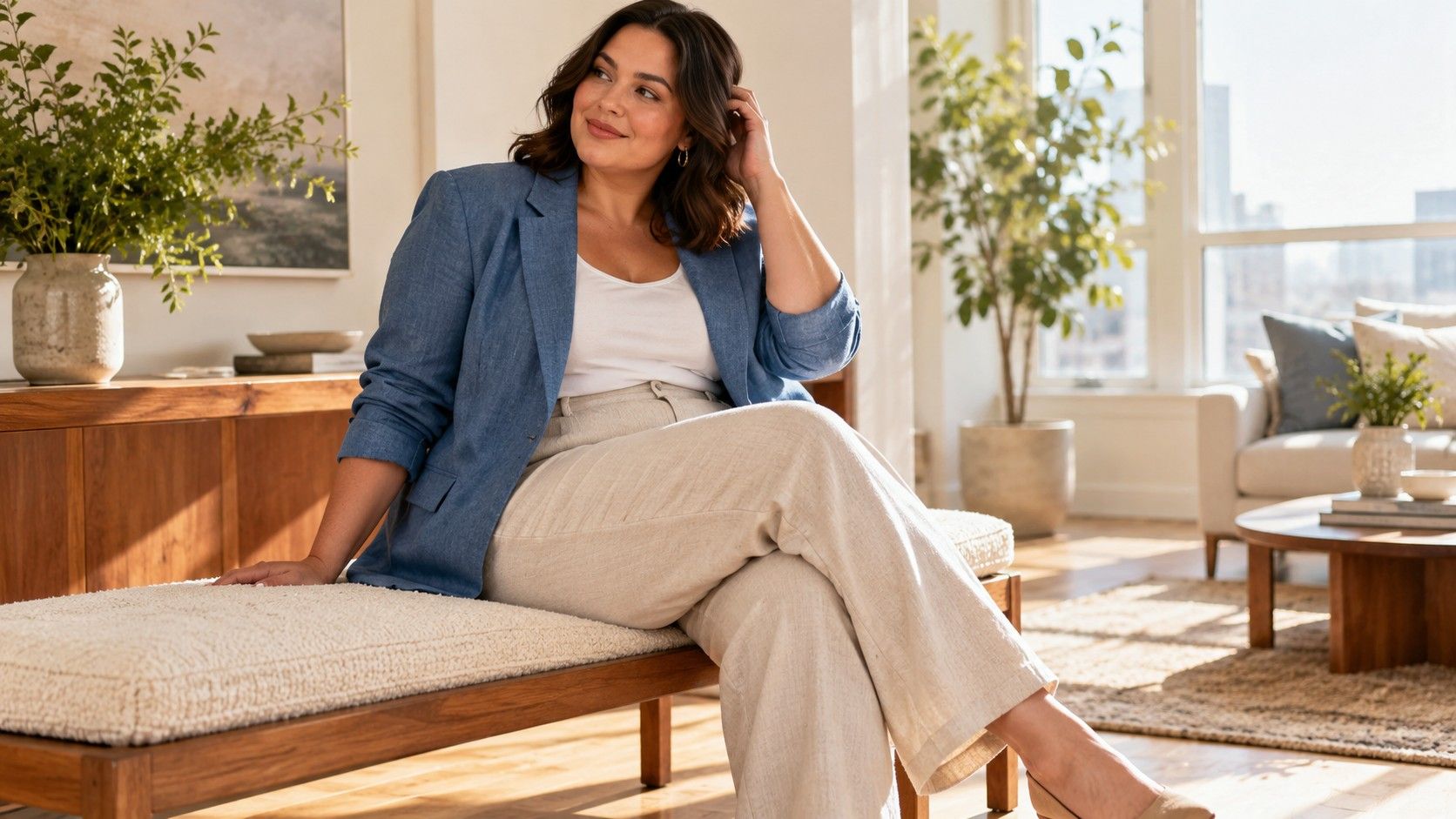
Two tops of the same size can create very different outlines. A fine woven shirt may fall close to the torso, a chunky knit may stand away, and a thin jersey may catch on the waistband beneath it. Pulling is also a fit issue: softness in the fabric does not guarantee enough room through the shoulders or upper arms. Reach forward and sit down before deciding the cut is easy.
Hold the fabric lightly at the side seam and let it fall. Then check it over your actual underwear and trousers. A clingy top might work well with a smoother base layer but become irritating over a high, textured waistband. If a garment needs constant rearranging, consider another fabric weight before moving up several sizes. Extra width can create different problems at the shoulder and neckline.
For layering, compare a lightweight cardigan over a woven top with a woven overshirt over a fine knit. The first may give more movement at the hem; the second may give a boundary you prefer. Keep enough room in the outer sleeve for the layer underneath. I like this practical comparison because it replaces the vague instruction to “add texture” with a visible choice about bulk, movement and comfort.
Build three outfits around ordinary daily plans
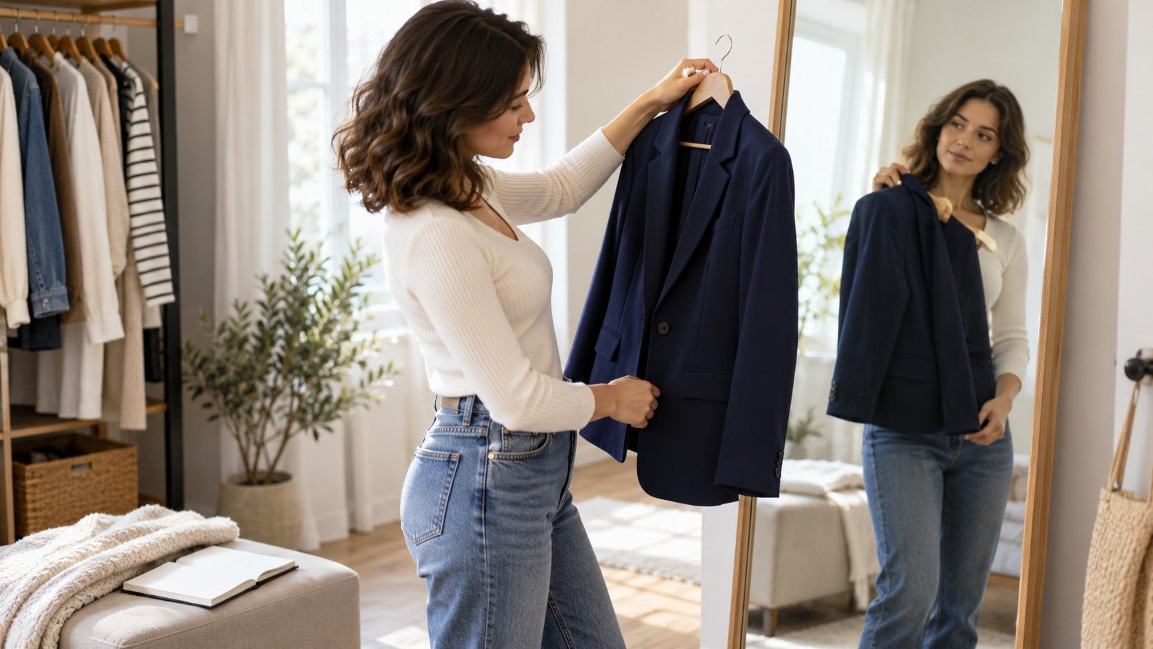
For a working day at a desk, try medium-weight straight trousers, a comfortable knit and a cardigan that clears the chair back. Sit for several minutes before approving the waist and sleeve fit. A long cardigan may look pleasing in the mirror yet catch beneath you whenever you stand. A shorter layer or a simple change of hem length can make the same colors easier to wear.
For errands on foot, start with the shoes you can walk in. Try them with jeans or trousers, then add a shirt and a jacket that leaves enough room for reaching and carrying a bag. Check the hem against the shoe rather than assuming cropped or full-length trousers are always better. Rain, pavement and your stride are more useful criteria than an outfit chart.
For a dinner or a casual event, a fluid dress with a light outer layer is one option. Another is familiar trousers with a more interesting neckline or fabric surface. Gentle shaping can come from seams, a wrap construction or the way a top is tucked. Check whether the neckline stays comfortable when you sit and lean forward. You should be able to enjoy the evening without holding an outfit in place.
You can repeat the same brown shoes, olive trousers and small bag across several combinations if they work together. A capsule earns its place through wear. Before adding a new piece, identify a real gap such as a washable top for warm days or a layer that fits under your coat. Buying a whole palette at once makes it harder to discover which garments you actually need.
Fix an outfit that feels flat one variable at a time
Start by naming what feels flat. Is the outfit too similar in color from neck to shoe, too bulky at the middle, or simply less expressive than you want? Those problems need different changes. Stand far enough from the mirror to see the whole outfit and look at the side view. Take one consistent photo if useful, while remembering that camera processing can change color and exposure.
The comparisons below are small enough to try with existing clothes. Leave the rest of the outfit alone during each test. Otherwise, a successful combination can be difficult to repeat because you have changed the shoe, belt, top and jacket together.
| What feels wrong | First experiment | What to observe |
|---|---|---|
| Colors merge more than you like | Choose a lighter or deeper top | Whether the boundary feels clearer |
| Too much fabric around the waist | Untuck or use a shallower tuck | Side-view bulk and seated comfort |
| Outfit feels visually quiet | Add one textured or patterned piece | Whether the extra detail feels like you |
| Layers look heavy | Replace one layer with a finer fabric | Hem movement and sleeve bunching |
Pattern can supply interest without a large difference between light and dark. Try a small check, a softened stripe or a mixed-color weave if you enjoy them. Scale and placement remain personal choices. A busy scarf close to your face may feel lively on one day and distracting on another; keep room for mood, setting and the rest of your outfit.
Give the successful version a real outing before shopping. Note whether you stayed comfortable, whether the colors pleased you in ordinary light and whether anything needed repeated adjustment. The most useful result is a sentence you can act on: “I like a lighter top with these trousers,” or “this cardigan needs a thinner sleeve underneath.” That knowledge is more portable than a rigid list of approved clothes.