A shirt in a favorite shade can still feel wrong because its sleeve pulls when you reach forward. Separating body shape from color analysis makes it easier to identify the actual problem before combining the two approaches. One concerns the way clothes relate to proportions and movement; the other offers a vocabulary for color preferences and comparisons. You can explore both with a few existing outfits, without finding a permanent label for yourself.
When the right color still feels wrong
A blue shirt can be a color you love and still pull across the upper arms. A beautifully cut jacket can feel too severe in a dark shade. I find it easier to deal with these as separate questions: does the garment let me move, and do I enjoy its color next to my face? Trying to solve both with a single body-type label usually sends the experiment in circles.
Body-shape descriptions concern relative proportions, such as the relationship between shoulders, waist and hips. Seasonal color systems offer ways to compare hue, lightness and saturation. Neither is a medical assessment, and a palette does not predict where a trouser waistband will sit. These are optional styling tools. A successful outfit still has to serve the person wearing it, including their taste, budget and ordinary day.
Before deciding that a color is the problem, look for construction issues. A shoulder seam may sit awkwardly; the collar may be too tight; excess fabric may collect above the waistband. Then cover the garment below the neckline with a plain cloth and look again. This is a rough comparison, not a definitive color test, but it can reveal whether you are reacting to the whole silhouette or mainly to the shade.
Give the silhouette its own fitting-room test
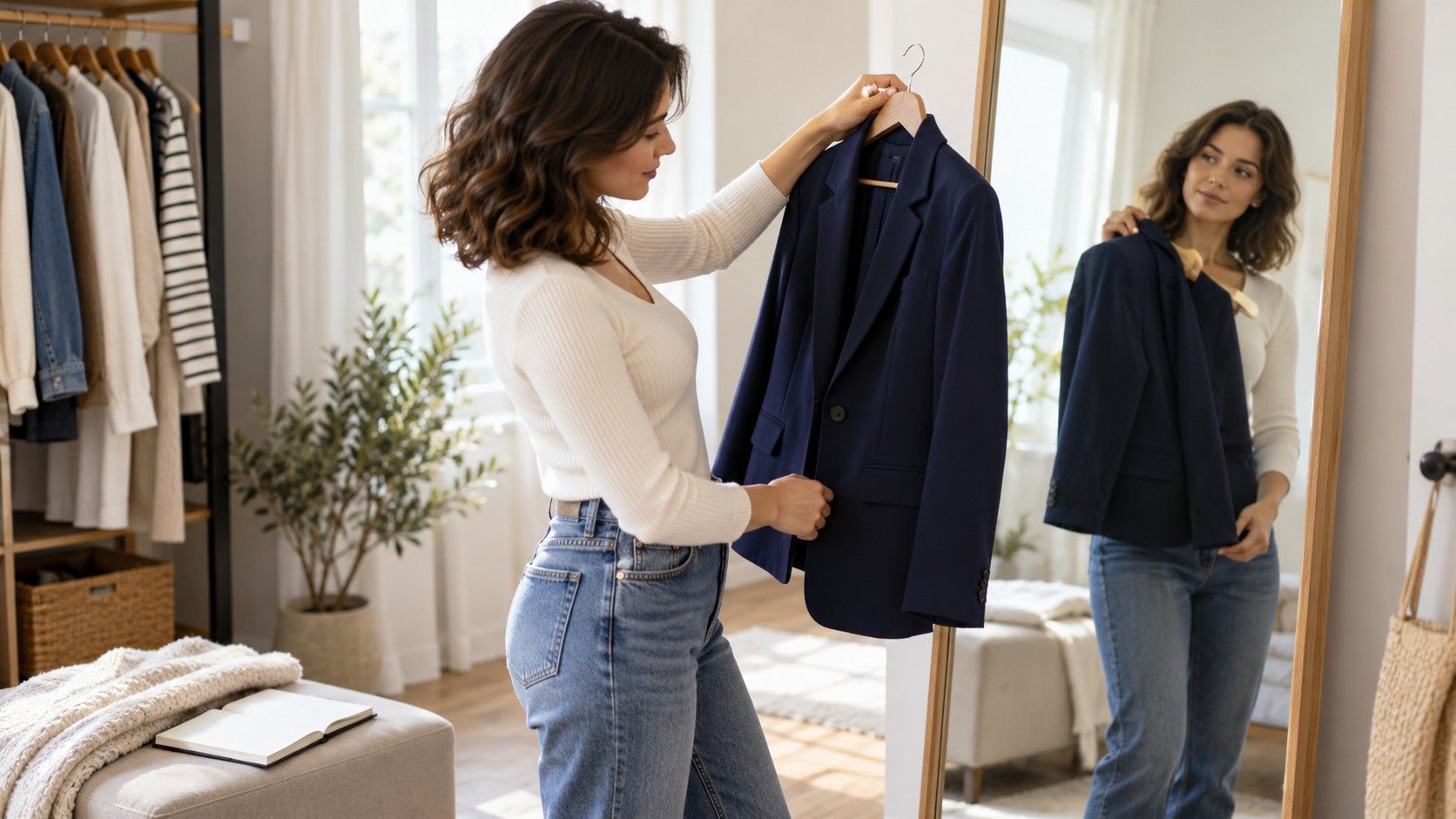
For the first comparison, choose garments in similar colors. Two navy shirts are more useful here than a white fitted blouse and an oversized orange sweater. Keep the trousers and shoes constant. Check the shoulder seams, sleeve opening and hem length, then raise your arms and sit down. Clothes that work only while you stand motionless offer limited evidence about everyday fit.
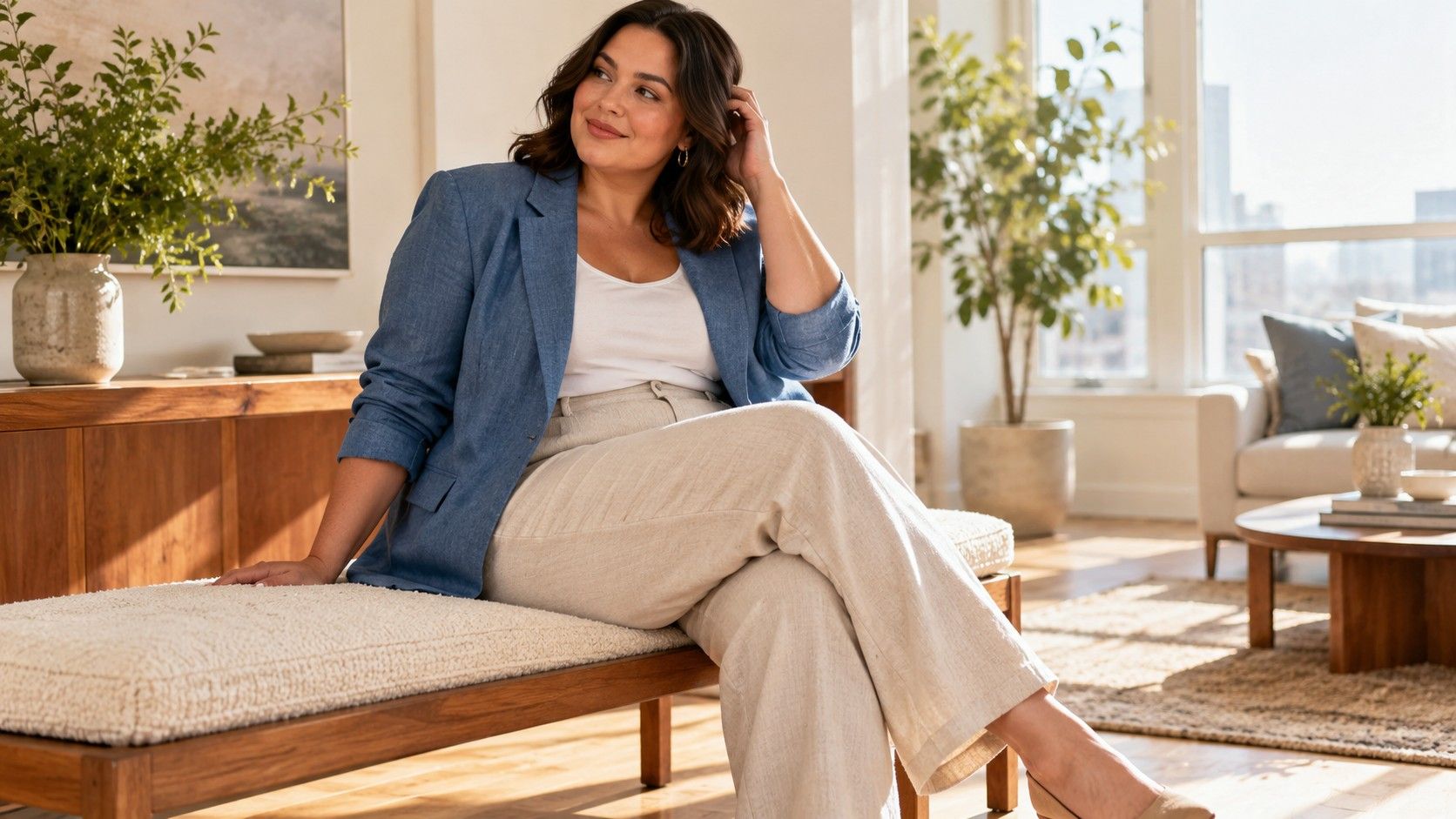
Ease is the room between your body and the garment. You may prefer generous ease in a linen shirt and less in a stretch top; neither choice needs a body-shape justification. Look at where fabric hangs freely and where it catches. Horizontal pulling across a button placket deserves attention before you spend time debating whether the blue is cool enough. A different size, cut or fabric may resolve the problem.
I also check waist placement rather than assuming a garment must end at my natural waist. Tuck the front of a shirt, release it, and compare the full-length view. Try the jacket open and closed. The useful result is a sentence such as “this hem catches on my hips when I walk” or “the shorter jacket works with these wide trousers.” Those observations are more portable than a broad claim that a shape should always wear short jackets.
Use one fabric change at a time where possible. A crisp cotton shirt and a fluid viscose blouse can create different outlines even when their measurements are close. If you change color, drape, neckline and length together, you can still choose the outfit you prefer, but you will have little idea which feature made the difference.
Compare color without changing the whole outfit
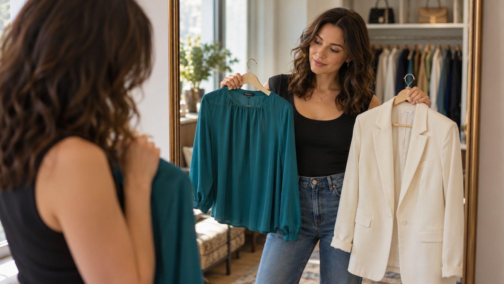
Once the fit is comfortable, keep that silhouette and compare colors near your face. A scarf or an existing T-shirt is enough to begin. Use the same room and an ordinary daylight position away from strong colored walls. Avoid comparing one outfit in direct sun with another under a warm bathroom bulb. Changing light can make the comparison less useful than it first appears.
Try two or three shades with a clear difference: soft blue against bright blue, light grey against charcoal, or cream against a clearer white. Notice what you actually prefer. You might enjoy a quiet transition between face and neckline, or a distinct frame around the face. Personal preference and the mood of the outfit belong in the decision. There is no need to turn a subtle visual impression into a claim about health or attractiveness.
Photographs can help you remember combinations, although phone exposure and white balance can change colors. Keep the camera position, background and settings as consistent as you can, and compare the real fabric again before buying. If a supposedly ideal shade feels dull to you, record that response. A seasonal name is not an obligation to enjoy every color associated with it.
Use three outfits to find the actual problem
Choose an outfit you wear often, one you like in theory but avoid, and one that feels almost right. Set aside a short session when you can walk around and sit at a table. Wear the underwear and shoes you normally use with each outfit. A trouser hem or a neckline can behave differently with those details changed, and a useful test should resemble the day you are dressing for.
| What you notice | Change to try first | What to keep constant |
|---|---|---|
| The shirt pulls when sitting | A cut with more room or a different fabric | Color, trousers and shoes |
| The outfit feels visually heavy near the face | A lighter neckline or a scarf you already own | Garment shape and layers |
| The proportions feel different in a full-length view | One tuck or hem adjustment | Palette and footwear |
| The pieces work separately but feel disconnected | Repeat one existing color in a small detail | Fit and garment lengths |
For the unworn outfit, identify the first moment it becomes inconvenient. Does the skirt twist on the walk to the station? Do the sleeves restrict reaching for a shelf? Or do you keep replacing the pale top with a darker one before leaving? These are different problems. Color and body type analysis becomes useful when it helps name a change you can test, rather than supplying a reason to reject your body.
Keep the comparison modest. Change one element, then wear the result for a normal task. An outfit may look pleasing in a photograph and feel fussy after twenty minutes at a desk. That information matters just as much as the photograph. You are building clothes for living, and the best evidence often arrives after the mirror session ends.
When the palette and silhouette advice disagree
You may read that your shape needs a dark lower half while your chosen palette contains mostly light or soft colors. The first statement is an aesthetic suggestion, not a requirement. Ask what effect you want: a continuous column, a clear waist, more emphasis on the shoulders, or simply a pale pair of trousers you enjoy. Without that question, two unrelated sets of advice can create a conflict that has no practical reason to exist.
If you want a continuous line, compare nearby colors on top and bottom instead of reaching automatically for black. If you enjoy a high-contrast outfit, try it and assess the whole arrangement, including shoes and jacket. A scarf can bring a favorite color near the face while leaving the rest of the outfit alone. None of these adjustments has to erase a feature or make you appear to be a different size.
Prints introduce another variable. Stand back to see whether a small pattern reads as a single color, then look at it close up to judge the contrast you enjoy. A print containing several palette colors may still feel busier than you want. Equally, a color outside your usual range can be the part that makes an outfit feel personal. Keep an exception if you like wearing it; you do not owe a framework perfect consistency.
Keep observations that survive a real day
My preferred wardrobe notes are short and physical: “collar comfortable with jacket,” “soft green works with these jeans,” or “waistband needs more room when seated.” Add a photograph if it helps, but describe the actual garment. “Avoid all warm colors” is difficult to use carefully; “I prefer the muted rust scarf to the bright orange one” gives you something specific to compare next time.
After a few wears, review the clothes you reached for without effort. Look for repeated details in fabric drape, ease, neckline, hem length and color contrast. You may find that a familiar shade makes it easier to try an unfamiliar silhouette, or that a reliable trouser cut lets you experiment with brighter tops. That is a practical way to combine the tools without demanding a perfect classification first.
Buy only when the experiment identifies a real gap. If an existing scarf answers the color question, you do not need a new coat to prove it. If a shirt fits poorly, a palette consultation will not alter its seams. Let each tool answer the question it can reasonably address, and judge the combination by comfort, usefulness and whether you want to put it on again.