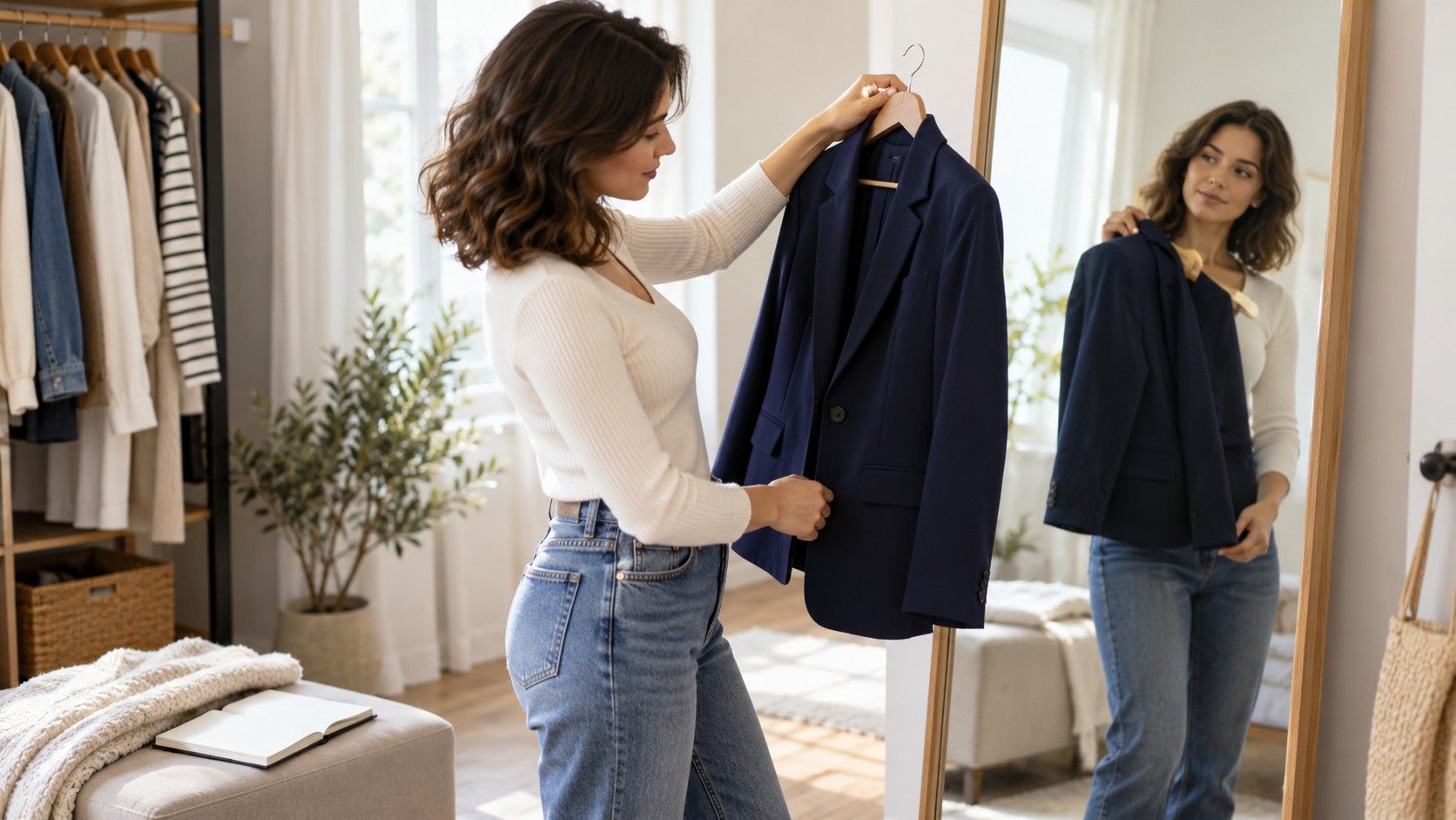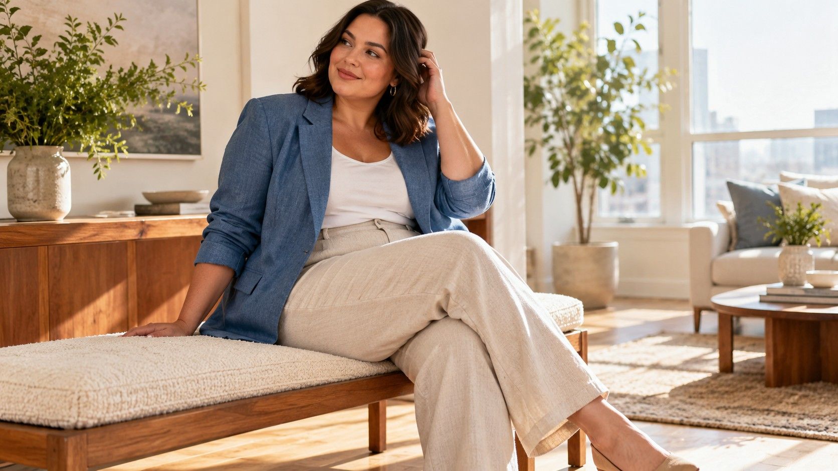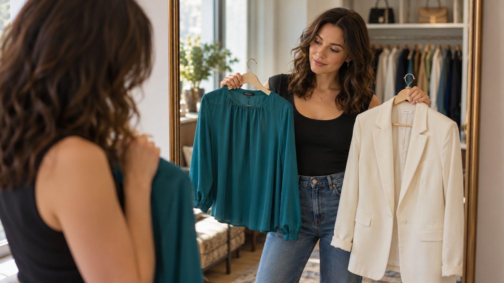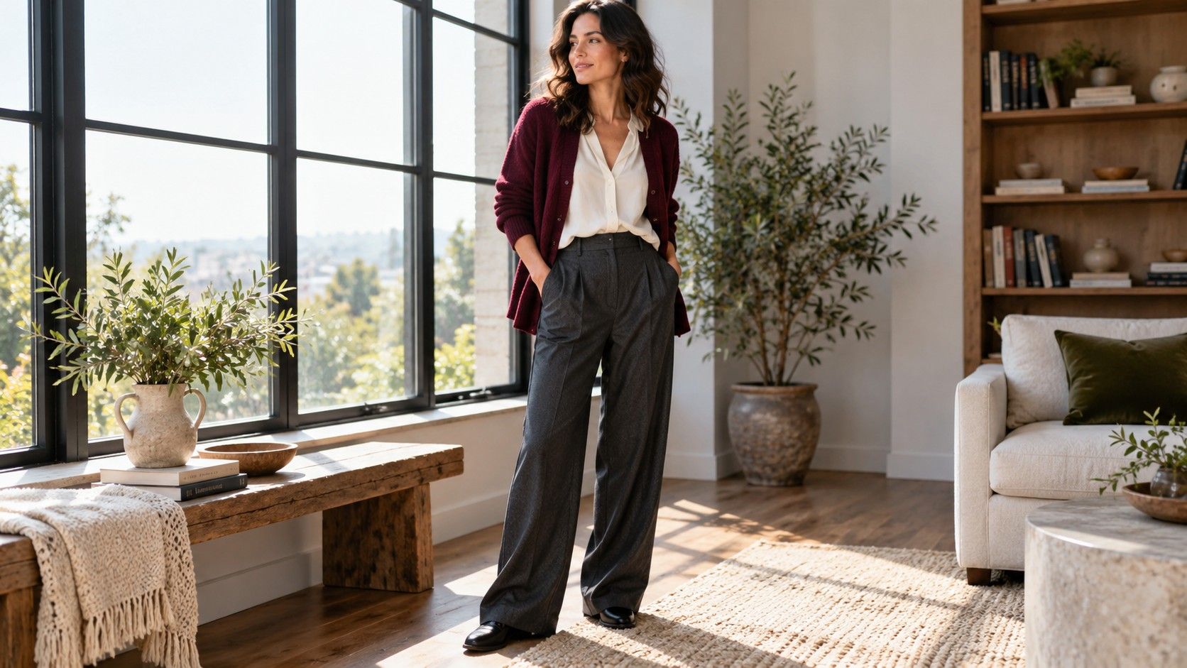
Relaxed clothing lines and clear, deep color can sit comfortably in the same wardrobe. The useful task is deciding where you want movement, where you want definition and how much contrast you enjoy. I prefer to test those questions with a familiar pair of trousers and a few tops before treating two style labels as instructions.
Keep the line question separate from the color question
A search for soft natural deep winter can lead to two apparently competing wardrobes: loose, textured clothes on one page and sharply contrasted, polished outfits on another. I would separate the decisions before buying anything. In style discussions, Soft Natural usually points toward relaxed construction, some softness and room for movement. Deep Winter is a seasonal color label commonly associated with depth, cooler color directions and clearer contrast. Neither label establishes a scientific category or an obligation to dress a certain way.
Use the first idea to ask what a garment does when you move. Use the second to explore which colors you enjoy near your face. A softly draped plum blouse can answer both questions, but a comfortable black T-shirt is a perfectly useful starting point. You do not need ruffles to demonstrate softness, or a white collar to demonstrate contrast. Those are design choices with separate effects.
Try one top in two colors with the same trousers. Then compare two cuts in a similar color. This takes some patience in a fitting room, yet it tells you more than comparing a tight white shirt with an oversized burgundy sweater. In that comparison, color, texture, silhouette and fit all change together. You cannot tell which change produced the result you liked.
Build a relaxed outfit that still has a clear shape
Begin with a shoulder and armhole check. Reach toward a shelf, cross your arms and sit down. A blouse may look easy at the waist while restricting the upper back. A dropped shoulder may feel good, or it may put a thick seam halfway down your arm where you dislike the bulk. The relevant question is where this particular garment hangs and how it feels, rather than whether its label says relaxed.
For a first combination, try straight trousers, a top that skims rather than grips, and an open overshirt. Leave enough room at the waistband for sitting comfortably. If the whole outfit feels shapeless to you, change one boundary: tuck a small section of the top, shorten the visible layer, or leave the overshirt unbuttoned so the inner outfit remains visible. Waist emphasis can be gentle; a tight belt is not a requirement.
Look at the side view as well as the front. A thick half-tuck can create a lump under a jacket, and a long shirt may catch over the seat instead of hanging freely. Sometimes an untucked top with a curved hem is the easier answer. I find the best adjustment is often less elaborate than the styling trick that first comes to mind. A different hem length can solve what looks like a problem with your proportions.
Choose how much contrast you want near your face
Black and white are an obvious test, although they are only one possible direction. Compare black with off-white, deep navy with a clear berry tone, or charcoal with a cool blue. These combinations can have quite different levels of visual contrast. If a white neckline keeps drawing your eye away from your face, try a smaller visible area or a darker second color. Preference matters even when an online palette says a combination should work.
Use the same mirror in indirect daylight, and keep makeup and camera settings consistent if you take comparison photos. Automatic phone exposure can brighten one outfit and darken another. Judge the clothes in the mirror as well as the image; do not treat a phone photograph as a test of your undertone. A color label is a wardrobe shorthand, not a diagnosis that a single picture can confirm.
A scarf offers a cheap experiment with contrast placement. Wear a dark column underneath, then compare a narrow strip of a lighter scarf with a broad pale panel. The fabric can sit loosely without losing its color effect. Earrings, a necklace or a visible T-shirt neckline can make the same experiment on a smaller scale. If you wear glasses every day, include them: the frame already contributes a line and a color near your face.
Let fabric move without making every layer bulky
A dark color cannot rescue fabric that fights the cut. Lift the hem of a blouse and release it: does it fall back, stand out, or cling? Soft jersey, fluid woven fabric and brushed knitwear behave differently even when all three look relaxed on a hanger. Try a short walk and a seated check before choosing. A fabric that drapes beautifully while standing may pull across your lap or creep upward as you move.
Compare an open cardigan with a woven jacket over the same inner outfit. The cardigan may soften the outline but add thickness at the sleeves. The jacket may look cleaner while feeling restrictive under the arms. Look for the combination of movement and definition you actually want. Texture does not need to mean roughness: a fine rib, subtle weave or soft matte surface can give interest without a heavy pile.
For cold weather, fit the outer coat over the layers you will really use. Test the sleeve with a sweater underneath and close the coat before reaching forward. A coat chosen over a thin changing-room top can be frustrating in January. You can keep the inner layers simple and introduce clearer color through a scarf or bag; the entire outfit does not need a fresh palette exercise every morning.
Check care instructions while comparing these fabrics. A fine knit that needs a separate washing routine may be less practical for you than a washable woven top. Dark shades can also show lint clearly, so look at the garment after wearing your coat over it. These small maintenance details affect whether a promising outfit becomes a weekday favorite or stays on the hanger.
Make a small capsule from clothes you can actually wear
Choose two bottoms, three tops and one outer layer from your current wardrobe. An example is black straight trousers, dark denim, a deep berry knit, a navy draped blouse, a charcoal T-shirt and an easy jacket. Treat these as candidates, not a required shopping list. Your weather, work rules and laundry routine should decide which garments deserve space.
Test the pieces in pairs and write down why an outfit works or fails. The short comparison below keeps the experiment specific. A note such as “sleeve bunches inside coat” is more useful than “not Soft Natural enough.” A note about enjoying the navy and berry combination is enough reason to repeat it.
| Outfit test | What to check | Small adjustment |
|---|---|---|
| Dark trousers and draped blouse | Pulling when seated; excess length at waist | Try a shallow tuck or different hem |
| Dark denim and berry knit | Sleeve room and fabric bunching | Use a lighter inner layer |
| Charcoal top with contrasting scarf | How much contrast you enjoy by the face | Fold the scarf to show less color |
| Full outfit under a coat | Upper-back movement and sleeve friction | Change layer thickness before coat size |
Wear your favorite combination for an ordinary day, including carrying a bag and sitting at your desk. That is where a short jacket can ride up, a neckline can need repeated adjusting, or a trouser waistband can become tiring. Keep the outfit if it survives your day comfortably. The goal is a repeatable set of clothes, with optional style language to help explain your preferences.